uyhjjddddddddddd Web Optimisation, Maths and Puzzles: test

Header tag

Showing posts with label test. Show all posts

Monday, 18 November 2024

Designing Personas for Design Prototypes

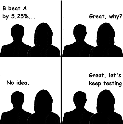
Part of my job is validating (i.e. testing and confirming) new designs for the website I work on.  We A/B test the current page against a new page, and confirm (or otherwise) that the new version is indeed better than what we have now.  It's often a last-stop measure before the new design is implemented globally, although it's not always a go/no-go decision.

The new design has gone through various other testing and validation first - a team of qualified user experience designers (UX)  and user interface designers (UI) will have decided how they want to improve the current experience.  They will have undertaken various trials with their designs, and will have built prototypes that will have been shown to user researchers; one of the key parts of the design process, somewhere near the beginning, is the development of user personas.

A persona in this context is a character that forms a 'typical user', who designers and product teams can keep in mind while they're discussing their new design.  They can point to Jane Doe and say, "Jane would like this," or, "Jane would probably click on this, because Jane is an expert user."

I sometimes play Chess in a similar way, when I play solo Chess or when I'm trying to analyze a game I'm playing.  I make a move, and then decide what my opponent would play.  I did this a lot when I was a beginner, learning to play (about 40 years ago) - if I move this piece, then he'll move that piece, and I'll move this piece, and I'll checkmate him in two moves!  This was exactly the thought process I would go through - making the best moves for me, and then guessing my opponent's next move.


It rarely worked out that way, though, when I played a real game.  Instead, my actual opponent would see my plans, make a clever move of his own and capture my key piece before I got chance to move it within range of his King.


Underestimating (or, to quote a phrase, misunderestimating) my opponent's thoughts and plans is a problem that's inherent with playing skill and strategy games like Chess.  In my head, my opponent can only play as well as I can. 

However, when I play solo, I can make as many moves as I like, but both sides can do whatever I like, and I can win because I constructed my opponent to follow the perfect sequence of moves to let me win.  And I can even fool myself into believing that I won because I had the better ideas and the best strategy.

And this is a common pitfall among Persona Designers (I've written a whole series on the pitfalls of A/B testing).  They impose too much of their own character onto their persona, and suddenly they don't have a persona, they have a puppet.

"Jane Doe is clever enough to scroll through the product specifications to find the compelling content that will answer all her questions."

"Joe Bloggs is a novice in buying jewellery for his wife, so he'll like all these pretty pictures of diamonds."

"John Doe is a novice buyer who wants a new phone and needs to read all this wonderful content that we've spent months writing and crafting."

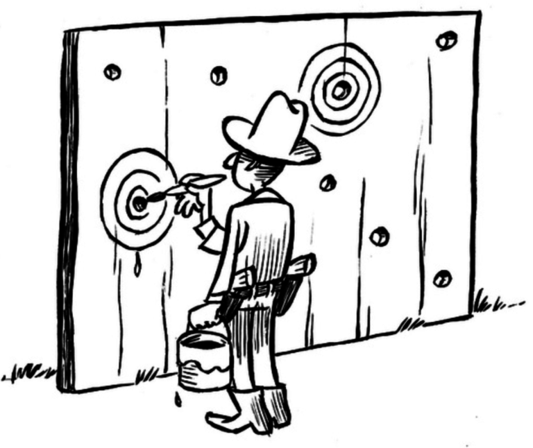
This is something similar to the Texas Sharpshooter Fallacy (shooting bullets at the side of a barn, then painting the target around them to make the bullet holes look like they hit it).  That's all well and good, until you realize that the real customers who will spend real money purchasing items from our websites, have a very real target that's not determined by where we shoot our bullets.  We might even know the demographics of our customers, but even that doesn't mean we know what (or how) they think.  We certainly can't imbue our personas with characters and hold on to them as firmly as we do in the face of actual customer buying data that shows a different picture.  So what do we do?


"When the facts change, I change my mind. What do you do, sir?"
Paul Samuelson, Economist,1915-2009


Monday, 1 December 2014

Why do you read A/B testing case studies?

Case studies.  Every testing tool provider has them - in fact, most sales people have them - let's not limit this to just online optimisation.  Any good sales team will harness the power of persuasion of a good case study:  "Look at what our customers achieved by using our product."  Whether it's skin care products, shampoo, new computer hardware, or whatever it may be.  But for some reason, the online testing community really, really seems to enthuse about case studies in a way I've not seen anywhere else.


Salesmen will show you the amazing 197% uplift that their customers achieved through their products (and don't get me started on that one again).  But what do we do with them when we've read them?  Browsing through my Twitter feed earlier today, I noticed that Qualaroo have shared a link from a group who have decided that they will stop following A/B testing case studies:


And here's the link they refer to.


Quoting the headlines from that site, there are five problems with A/B testing case studies:

  1. What may work for one brand may not work for another.
  2. The quality of the tests varies.
  3. The impact is not necessarily sustainable over time.
  4. False assumptions and misinterpretation of result.
  5. Success bias: The experiments that do not work well usually do not get published.
I've read the article, and it leaves me with one question:  So, why do you read A/B testing case studies?  The article points out many of the issues (some of them methodical, some statistical) with A/B testing, leading with the well-known 'what may work for one brand may not work for another' (or "your mileage may vary").  I've covered this, and some of the other issues listed here before, discussing why I'm an A/B power-tool skeptic.

I came to the worrying suspicion that people (and maybe Qualaroo) read A/B testing case studies, and then implement the featured test win on their own site with no further thought.  No thought about if the test win applies to their customers and their website, or even if the test was valid.  Maybe it's just me (and it really could be just me), but when I read A/B testing case studies, I don't immediately think, 'Let's implement that on our site'.  My first thought is, 'Shall we test that on our site too?'.


And yes, there is success bias.  That's the whole point of case studies, isn't it?  "Look at the potential you could achieve with our testing tool," is significantly more compelling than, "Use our testing tool and see if you can get flat results after eight weeks' of development and testing".  I expect to see eye-grabbing headlines, and I anticipate having to trawl through the blurb and the sales copy to get to the test design, the screenshots and possibly some mention of actual results.

So let's stick with A/B tests.  Let's not be blind to the possibility that our competitors' sites run differently from ours, attract different customers and have different opportunities to improve.  Read the case studies, be skeptical, or discerning, and if the test design seems interesting, construct your own test on your own site that will satisfy your own criteria for calling a win - and keep on optimising.

Friday, 11 July 2014

Is Multi-Variate Testing Really That Good?

The second discussion that I led at the Digital Analytics Hub in Berlin in June was entitled, "Is Multi Variate Testing Really That Good?"  Although only a few delegates attended, it got some good participation from a range of people representing a range of analytical and digital professionals, and in this post I'll cover some of the key points.

- The number of companies using MVT is starting to increase, although it's a very slow increase and it still has only low adoption rates. It's not as widespread as perhaps the tool vendors would suggest.

- The main barriers (real or perceived) to MVT are complexity (in design and analysis) and traffic volumes (multiple recipes require large volumes of traffic in order to get meaningful results in a useful timeframe).

There is an inherent level of complexity in MVT, as I've mentioned before (and one day soon I will explain how to analyse the results) and the tool vendors seem to imply that the test design must also be complicated.  It doesn't.  I've mentioned in a previous post on MVT that sometimes the visual design of a multi-variate test does not have to be complicated, it can just involve a large number of small changes run simultaneously.   

The general view during the discussion was that MVT would have to involve a complicated design with a large number of variations per element (e.g. testing a call-to-action button in red, green, yellow, orange and blue, with five different wordings).  In my opinion, this would be complicated as an A/B/n test, so as an MVT it would be extremely complex, and, to be honest, totally unsuitable for an entry-level test.

We spent a lot of our discussion time discussing various pages and scenarios where MVT is totally unsuitable, such as site navigation.  A number of online sites have issues with large catalogues and navigation hierarchies, and it's difficult to decide how best to display the whole range of products - MVT isn't the tool to use here, we discussed card-sorting, brainstorming and visualisations instead of A/B testing.  This was one of the key lessons for me - MVT is a powerful tool, but sometimes, you don't need a powerful tool, you just need the basic one.  A power drill is never going to be good at cutting wood - a basic handsaw is the way to go.  It's all about selecting the right tool for the job.

Looking at MVT, as with all online optimisation programs, the best plan is to build up to a full MVT in stages, with initial MVT trials run as pilot experiments.  Start with something where the basic concept for testing is easy to grasp, even if the hypothesis isn't great.  The problem statement or hypothesis could be, "We believe MVT is a valuable tool and in order to use it, we're going to start with a simple pilot as a proof of concept."  And why not? :-)

Banners are a great place to start - after all, the marketing team spend a lot of money on it, and there's nothing quite as eye-catching as a screenshot of a banner in your test report documents and presentations.  They're also very easy to explain... let's try an example.  Three variables that can be considered are gender of the model (man or woman), wording of the banner text ("Buy now" vs "On Sale") and the colour of the text (black or red).

There are eight possible combinations in total; here are a few potential recipes:


Recipe A
Recipe B
Recipe C
Recipe D

Note that I've tried to keep the pictures similar - model is facing camera, smiling, with a blurred background.  This may be a multi-variate test, but I'm not planning to change everything, and I'm keeping track of what I'm changing and what's staying the same!!

Designing a test like this has considerable benefits: 
- it's easy to see what's being tested (no need to play 'spot the difference')
- you can re-use the same images for different recipes
- copywriters and merchandisers only need to come up with two lots of copy (which will be less than in an A/B/C/D test with multiple recipes).
- it's not going to take large numbers of recipes, and therefore is NOT going to require a large volume of traffic.

Some time soon, I'll explain how to analyse and understand the results from a multi-variate test, hopefully debunking the myths around how complicated it is.

Here's my series on Multi Variate Testing

Preview of Multi Variate testing
Web Analytics: Multi Variate testing 
Explaining complex interactions between variables in multi-variate testing
Is Multi Variate Testing an Online Panacea - or is it just very good?
Is Multi Variate Testing Really That Good (that's this article)
Hands on:  How to set up a multi-variate test
And then: Three Factor Multi Variate Testing - three areas of content, three options for each!

Image credits: 
man  - http://www.findresumetemplates.com/job-interview
woman - http://www.sheknows.com/living 


Wednesday, 14 May 2014

Testing - which recipe got 197% uplift in conversion?

We've all seen them.  Analytics agencies and testing software providers alike use them:  the headline that says, 'our customer achieved 197% conversion lift with our product'And with good reason.  After all, if your product can give a triple-digit lift in conversion, revenue or sales, then it's something to shout about and is a great place to start a marketing campaign.

Here are a just a few quick examples:

Hyundai achieve a 62% lift in conversions by using multi-variate testing with Visual Website Optimizer.

Maxymiser show how a client achieved a 23% increase in orders

100 case studies, all showing great performance uplift


It's great.  Yes, A/B testing can revolutionise your online performance and you can see amazing results.  There are only really two questions left to ask:  why and how?

Why did recipe B achieve a 197% lift in conversions compared to recipe A?  How much effort, thought and planning went into the test? How did you achieve the uplift?  Why did you measure that particular metric?  Why did you test on this page?  How did you choose which part of the page to test?  How many hours went into the planning for the test?

There is no denying that the final results make for great headlines, and we all like to read the case studies and play spot-the-difference between the winning recipe and the defeated control recipe, but it really isn't all about the new design.  It's about the behind-the-scenes work that went into the test.  Which page should be tested?  It's about how the design was put together; why the elements of the page were selected and why the decision that was taken to run the test.  There are hours of planning; analysing data and writing a hypothesis that sit behind the good tests.  Or perhaps the testing team just got lucky?  

How much of this amazing uplift was down to the tool, and how much of it was due to the planning that went into using the tool?  If your testing program isn't doing well, and your tests aren't showing positive results, then probably the last thing you need to look at is the tool you're using.  There are a number of other things to look at first (quality of hypothesis and quality of analysis come to mind as starting points).

Let me share a story from a different situation which has some interesting parallels.  There was considerable controversy around the Team GB Olympic Cycling team's performance in 2012.  The GB cyclists achieved remarkable success in 2012, winning medals in almost all the events they entered.  This led to some questions around the equipment they were using - the British press commented that other teams thought they were using 'magic' wheels.  Dave Brailsford, the GB cycling coach during the Olympics, once joked that some of the competitors were complaining about the British team's wheels being more round

Image: BBC

However, Dave Brailsford previously mentioned (in reviewing the team's performance in the 2008 Olympics, four years earlier) that the team's successful performances there were due to the "aggregation of marginal gains"in the design of the bikes and equipment, which is perhaps the most concise description of the role of the online testing manager.  To quote again from the Team Sky website:


The skinsuit did not win Cooke the gold medal. The tyres did not win her the gold medal. Nor did her cautious negotiation of the final corner. But taken together, alongside her training and racing programme, the support from her team-mates, and her attention to many other small details, it all added up to a significant advantage - a winning advantage.
Read more at http://www.teamsky.com/article/0,27290,17547_5792058,00.html#zuO6XzKr1Q3hu87X.99
"The skinsuit did not win Cooke [GB cyclist] the gold medal. The tyres did not win her the gold medal. Nor did her cautious negotiation of the final corner. But taken together, alongside her training and racing programme, the support from her team-mates, and her attention to many other small details, it all added up to a significant advantage - a winning advantage."

It's not about wild new designs that are going to single-handedly produce 197% uplifts in performance, it's about the steady, methodical work in improving performance step by step by step, understanding what's working and what isn't, and then going on to build on those lessons.  As an aside, was the original design really that bad, that it could be improved by 197% - and who approved it in the first place?

It's certainly not about the testing tool that you're using, whether it's Maxymiser, Adobe's Test and Target, or Visual Website Optimizer, or even your own in-house solution.  I would be very wary of changing to a new tool just because the marketing blurb says that you should start to see 197% lift in conversion just by using it.

In conclusion, I can only point to this cartoon as a summary of what I've been saying.