Header tag

Thursday, 20 October 2016

English Premier League: Which Season Ticket is the Best Value?

In my two previous posts, I've examined the data for the English Premier League for the last ten seasons, reviewing how 'exciting' each season has been.  I've drawn some conclusions, segmented the data and found some interesting data points, but not yet produced anything that's really useful, or that can help a football fan.

It's time to move on, and to provide some useful facts and figures that are more meaningful and more useful than I've written previously - in particular, to look at the relative value and cost of season tickets for each of the teams.  But first, a quick recap:

Post number 1: Less than 10% of English Premier League games are goal-less (0-0) draws.
Post number 2:  Arsenal consistently achieve more goals per game (scored plus conceded) than average, while Everton frequently have fewer goals per game than average.

All very interesting and fascinating and useful to quote, but not really anything you can do anything with.  So far, the best recommendation I could make is: "If you were given the choice between watching an Arsenal game or an Everton game, I'd recommend the Arsenal game."

What I propose to do next is to start connecting the data I have to some additional data that will help form recommendations - in this case (and in most cases in business), money.  Money, in the form of reduced costs or increased sales and revenue, is often the essential part of any business recommendation, and I can apply the same process here.  We know how many goals per game (on average) we will see for each team in the English Premier League, but what we haven't yet identified is how much it would cost to see each game, and how much it will cost per goal.

In order to calculate this, I've taken the data from 2015-16 (the most recent completed season) and looked at the costs of season tickets, using the Sky Sports website for the costs.  I'm using the cheapest standard adult season ticket cost in each case.
Image credit

Jumping straight into the analysis - let's compare the cost of a season ticket to the average number of goals per game for the 2015-16 season:


And then compare the season tickets on a "cost per goal" basis, again for the 2015-16 season:


Isn't it interesting how the data has become more relevant, meaningful and even actionable when you start introducing money?

Arsenal may usually have the largest number of goals per season (or per game), and consistently achieve over-average performance there, but if you want to watch 'exciting' football of their type, you're going to have to pay for it.  (Note that the 2015-16 season was lower than usual for Arsenal, who actually came in below average for goals per game).

If you want the best value for your season ticket, then Man City is the place to go, at just £2.67 per goal - and you'll see plenty of goals too, 

This data could be displayed geographically (are London clubs better value than other regions?) or sorted in various other ways.  Beware, though, while you do this, of introducing apparent trends in your data when there is none:


This one isn't too bad, although it does look like season tickets are coming down in price.


This second one, though, makes it appear that (1) there is a trend, and (2) season ticket prices are going up (which is generally the case).

In Summary

In this series, I've moved from data to analysis to insight:

Post number 1: Less than 10% of English Premier League games are goal-less (0-0) draws. Data, and analysis

Post number 2:  Arsenal consistently achieve more goals per game (scored plus conceded) than average, while Everton frequently have fewer goals per game than average.  Analysis, but still nothing actionable.


Post number 3 (this post):  Arsenal may have the most goals on average, but in 2015-16 the cost of seeing a goal (£10.25) was much higher than the other clubs: 20% higher than the next-highest (Southampton, £8.53) and nearly four times higher than seeing a goal at Man City (£2.67, actually 3.83 times more).

Recommendations:
If you have the choice of watching an Everton match or an Arsenal match as a neutral, pick the Arsenal match.

Buy a season ticket for Many City, Villa, or West Brom.  If you want to follow a London club, the best value season ticket for London was Chelsea at £4.77 per goal, still half the price of an Arsenal ticket.  Actionable analysis.


Review
In a future post, I'll look at this worked example, pulling apart the differences between data, analysis, actionable analysis and insight


Wednesday, 12 October 2016

How exciting is the English Premier League?

So, it's the start of the English Premier League (EPL) season. Sport generates vast amounts of data, all available for analysis and insight, and in this post (and probably a couple of following posts), I will be looking at the English Premier League (football, aka soccer) for recent years and reviewing how the game has changed. This will form a practical look at data, reporting, analysis, insight and actionable analysis.

This is a reconstructed post: I originally posted this in September but the post has since been deleted or lost.  Here's what I can remember of it.


There are a number of questions to be asked (and answered):


How 'exciting' is the English Premier League?

How many goals can you expect to see per game?
How many games end in goal-less draws?
How many games are won by a one-goal margin (perhaps a good definition of a tense, exciting game).

This data can then be used to compare the English Premier League with other leagues (in the UK and abroad).

So, to start with, what's the average number of goals per game (total scored by both teams) for each of the last eleven seasons.

And the answer is:

And how does this compare with the percentage of games that are dull, uninteresting, goal-less draws?


The line graph above shows the percentage of goal-less draws.  It doesn't exactly trend with the average number of goals per game, but when the percentage of goalless draws is high (2008-2009) then the average goals per game is low (less than 2.5).

This does lead to an interesting point that would make marketers and headline-writers happy: "Less than 10% of EPL games end in goalless draws" (excluding 2008-2009).

Now we can see that 2006-2007 had the lowest average number of goals per game, while 2011-2 had the highest; we can then analyse these two seasons side by side - see below - to understand where the differences were.

Key points:
- 2007 had 34 0-0 draws, compared to 27 for 2012.  Only 2008-9 had fewer (25).
- 2011-2 had more games with five, six, seven, eight and ten goals.  
- The highest scoring game in 2006-7 was Arsenal 6 - Blackburn 2.  
- In 2011-12, the highest scoring game was Man United 8 - Arsenal 2.

Finally, which seasons were most interesting from the perspective of one-goal winners?  Not just 1-0, but 2-1, 3-2, 4-3 and so on.   
2011-12, with its huge average number of goals per game, doesn't do so well here.  2006-7 and 2007-9, the two games with low goals per game and high percentage of goalless draws, does marginally better - they were both really mean seasons.

Football data obtained from this football website; others are available.

--

Summary

Analysing the data at this level - with trended comparisons - has given us the ability to compare one time period with another.  There's nothing actionable here, but we get a nice headline about the percentage of 0-0 draws.  In the next post I wrote (chronologically, before the original version of this post was lost), I segmented the data by team, and that provided more interesting insights.

Other articles I've written looking at data and football

Checkout Conversion:  A Penalty Shootout
When should you switch off an A/B test?
The Importance of Being Earnest with your KPIs
Should Chelsea sack Jose Mourinho? (It was a relevant question at the time, and I looked at what the data said)
How Exciting is the English Premier League?  what does the data say about goals per game?

Friday, 23 September 2016

Premier League Excitement - Further Analysis

In my last post I looked at 'How exciting is the Premier League' and produced the interesting data point that less than 10% of Premier League games are goal-less.  This may be interesting, and it might even count as insight, but it's not very actionable.  We can't do anything with it, or make any decisions from it.  I suppose the question is, "Is that a lot?" and I'll be looking at that question in more detail in future.

So, my next step is to look at how the different teams in the Premier League compare on some of the key metrics that I discussed - goals per game (total conceded plus scored), percentage of goalless games and so on.

Number of goals per game (conceded plus scored)

Firstly, I segmented the data per team:  how many goals were there per game for each team in the Premier League.  This is time-consuming, but worthwhile, and a sample of the data is shown below.  I have data as far back as the 2004-5 season, but the width wouldn't fit on this page: 
Club
Y2010
Y2011
Y2012
Y2013
Y2014
Y2015
Y2016
Arsenal
        2.58
        3.03
        3.24
        2.87
        2.87
        2.82
        2.66
Aston Villa
        2.21
        2.82
        2.37
        3.05
        2.63
        2.32
        2.71
Birmingham

        2.50


Blackburn
        2.79
        2.76
        3.32


Bolton
        2.61
        2.84
        3.24


Charlton
        2.47


Chelsea
        2.32
        2.68
        2.92
        3.00
        2.58
        2.76
        2.95
Crystal Palace


        2.13
        2.58
        2.37
Everton
        2.32
        2.53
        2.37
        2.50
        2.63
        2.58
        3.00
Fulham
        2.58
        2.42
        2.61
        2.89
        3.29


Liverpool
        2.21
        2.71
        2.29
        3.00
        3.97
        2.63
        2.97
Man City
        1.92
        2.45
        3.21
        2.63
        3.66
        3.18
        2.95
Man United
        2.89
        3.03
        3.21
        3.39
        2.82
        2.61
        2.21
Middlesbrough
        2.45


Newcastle
        2.24
        2.97
        2.82
        2.97
        2.68
        2.71
        2.87
Norwich


        3.11
        2.61
        2.37

        2.79
Portsmouth
        2.29


Southampton


        2.87
        2.63
        2.29
        2.63
Tottenham
        2.92
        2.66
        2.82
        2.95
        2.79
        2.92
        2.74
West Brom

        3.34
        2.55
        2.89
        2.68
        2.34
        2.16
Wigan
        2.53
        2.66
        2.74
        3.16


Season Average
2.77
2.80
2.81
2.80
2.77
2.57
2.70

Blank columns indicate a season where a team was not in the Premier League.  
Bold figures show where a team achieved over 3 goals per game for the season.
Y2008 indicates the season 2007-2008.
Firstly:  sorting alphabetically makes sense from a listing perspective, but for comparison the data is best sorted numerically (from highest to lowest). 

Secondly:  There's a lot of data here, and clearly a visualisation is needed:  I'm going with a line graph.  And to avoid spaghetti, I'm going to highlight some of the key teams - the team with the highest average number of goals per game; the team with the lowest, and the average.

Thirdly:  to identify the overall highest- and lowest-goal teams, I'm just going to take the totals of the averages for the last nine seasons, and sort them from the list.  Teams that were not in the Premier League for one or more seasons are included based on their performance while they were in the Premier League.

Premier League Teams:  Average number of goals per game over the last 12 seasons:

Club
Average
Arsenal
      2.842
Tottenham
      2.833
Man City
      2.825
Blackburn
      2.816
Man United
      2.807
Liverpool
      2.781
Newcastle
      2.751
Norwich
      2.717
Bolton
      2.705
Overall Average
      2.702
Birmingham
      2.671
Chelsea
      2.670
West Brom
      2.669
Aston Villa
      2.667
Fulham
      2.613
Southampton
      2.605
Wigan
      2.566
Everton
      2.518
Charlton
      2.474
Middlesbro
      2.404
Portsmth
      2.368
Crystal Palace
      2.360

Key takeaways:  
- Arsenal have had the most total goals per game over the last nine seasons (2.842 goals per game)
- Everton have the lowest average number of goals per game for teams which have been present in all 12 seasons (2.518 goals per game).
- Put another way:  Arsenal fans have seen 1296 league goals in the last 12 seasons, compared to 1148 for Everton fans (148 fewer).


Theo Walcott, celebrating during Arsenal's win over Hull, Sept 2016  Image credit

Time for some graphs!

Firstly, average goals per season, for the last 12 seasons, for Arsenal, Everton, the league average, Liverpool (who achieved an average of 3.97 in 2013-14) and Man United (because they're always worth comparing).


This shows clearly that Arsenal (green line) have consistently exceed the league average, falling below it only twice in the last 12 seasons.  Everton (blue) have only once exceeded the average, and that was in the most recent season.  Liverpool have exceeded the average over the last four seasons, but prior to that were consistently below (and similar to Everton).

Connecting this to 'real life' events:

- Everton moving from David Moyes to Roberton Martinez in August 2013 did not make any difference to their 'excitement' factor until the 2015-16 season.

- Arsenal, and Arsene Wenger, could not be called 'boring' based on their goals per game. 

- Brendan Rogers had an interesting time at Liverpool, when they hit the highest goals-per-game for the season for any club in the last 12 years (3.97).  Note that this does not discriminate between goals scored or conceded.

Secondly, adjusting the data to show the difference between each team and the overall average (so that the data shows a delta versus the average).


To give you an indication of Liverpool's remarkable 2013-4 season:  their games had more than one goal per game more than the season average.  Brendan Rogers had an eventful time at Liverpool.

Fulham also had an 'exciting' season in 2013-4, achieving 3.29 goals per game (average was 2.77) - but were subsequently relegated.

In summary:

- Arsenal have had the highest average goals per game over the last nine seasons (2.842 goals per game), while Everton have the lowest, at 2.518 goals per game.
- Arsenal have exceeded the league average goals per game in 10 out of the last 12 seasons, and have the highest average overall.
- Man United have achieved above-average goals per game in nine of the last 12 seasons; however the 2015-16 season was the least 'exciting' they've recorded in that period.

Review

Segmenting the data by team is proving more useful.  It's now possible to make predictions about the 2016-17 season:

- Arsenal to remain most 'exciting', closely followed by Tottenham and Man City.
- Everton to remain the least 'exciting', with 1-1, 2-1 and 2-0 results dominating.
- Man United are extremely unpredictable, especially as they have a new manager this season (although nobody could have predicted the dreadful start they've made to the current season).

The raw data used in this analysis is available from the football data website, among others.

More articles on data analysis in football:

Reviewing Manchester United's Performance
Should Chelsea Sack Jose Mourinho? (it was relevant at the time I wrote it)
How exciting is the English Premier League?  (quantifying a qualitative metric)
The Rollarama World Football Dice Game (a study in probability)

Monday, 15 August 2016

Data, Analysis, Insight and Wisdom

Good web analysts love producing 'actionable insights' - it's the way we add value to the business we're in; it makes our managers happy - it's like finding hidden treasure.  But what are actionable insights (five years ago I asked who makes them actionable - the analyst or the manager) and how can get better at finding them and sharing them?

Web analytics starts with data - this could be various  kinds of data depending on the business model you're following.  So, in order to keep things industry-neutral, I'm going to focus on an unrelated area, and see what we can learn from it.  Yes, I'm going back to my old favourite:  reporting and analysing the weather.


In meteorology, scientists gather all kinds of data from the atmosphere.  They are interested in collecting multiple types of data - or "data points" - from multiple sources in various ways.  And the good news is that this data is quantitative (it can be given a number).

A thermometer will tell you the air and ground temperature - how comfortable things are at the moment
A barometer - the air pressure where you are at the moment
A hygrometer will measure humidity (or possibly rainfall) - depending on conditions
An anemometer - is used to measure wind speed and direction , and will tell you which way things are going to change and where to look for what's coming next.

Each instrument will tell you different things about how things are at the moment.  The anemometer can tell you which way things are going to change, and to some extent, which way to look to see what's going to happen next.  The data that these devices will give you will almost always be numerical (or partly numerical), and certainly abstract.  Each one individually will give you a partial picture of the current situation.  None of them by themselves will actually tell you anything meaningful:  is it raining?  Yes, but has it started, has it stopped, is it getting heavier or lighter?  The temperature may be 16o C but what time of day is it; what time of year is it and is the temperature going up or down?

What is needed here is some analysis.

Analysis is the art of combining the data sources to tell you something more meaningful, with a wider view, and painting a better picture.

One of the easiest forms of analysis is comparison.  It's hot today, but is it hotter than yesterday, this time last week, or this time last year?  Meteorologists typically compare year on year - there's little benefit in comparing sunny May with rainy April (in the UK, in theory).  But comparing May 2016 with May 2015 will tell you if we're having a good spring season.

And comparison leads naturally to trending.  It might be raining more today than it was yesterday, but how does that pattern compare over a longer time period?  And if you want to present this data to a wider audience, you'll either compile a table of data, or produce a graph of your data.  And the analysis is already starting - comparing two forms of data (typically time and another measurement) and producing comparable data (and possibly even trends).

Another form of analysis is statistical analysis - comparing averages, ranges, populations and so on.  Providing you and your audience are agreed on which average you're taking, what it means and what its potential drawbacks are, this can be a very useful form of analysis.


A note:  analysis is not just plotting graphs.  No, really, it isn't.  A spreadsheet can plot graphs, but analysis requires brainpower.  Therefore, plotting graphs (by itself) isn't analysis.  It can help to direct your analysis, and tell you what the data is saying, but a graph is just a set of lines on a page.  Plotting good, meaningful graphs is an exercise by itself, and data visualization is a whole subject of its own.  And a sidenote to this note: there are times when a simple, basic bar chart will be more informative and drive more action than any trendy visualisation with arrows, flowcharts and nodes.  Good doesn't mean visually impressive.

Good analysis breaks down the data into meaningful and relevant sections that will start to tell you more than just the individual data points.  Analysis will combine data points:  for example, imagine combining temperature data combined with geographic data, compared to average data:


This data has been presented in a very accessible way, and you can see at a glance that the southern half of the UK had a slightly-wetter-than-average January, whereas the northern half of the UK, and especially Scotland, was much drier than average.  

This is analysis clearly presented.  However, it isn't insight:  I haven't explained why the rainfall varied so much.  And if you're looking to explain why the rainfall in January was less than in June (for example), then you can easily point to annual trends:  the rain in January is always less than in June.

Insight

Insight is the next step from analysis, and insight will often show you WHY something is happening.  Yes, I know you won't fully answer "why" visitors behave in the way they do just by consulting quantitative data, but it's a start - and additionally, you'll be able to answer why a number went up, down or sideways.  You'll know you're beginning to show insight when you've stopped drawing graphs and tables, and started writing in sentences.  And not just describing what the data is saying, either, but explaining what's actually happening and the underlying causes.  "Total sales this week fell from 100k to 74k" isn't analysis.  "Total sales fell from 100k to 74k due to the conclusion of the summer sale and a drop in men's shoe sales; last year we continued the sale for an extra month and consistently achieved 100k+ sales for an additional three weeks with no loss of profit."

Or, to keep within the weather theme: "Rainfall in the south and east was above average throughout June due to a series of Atlantic storms which passed over continental Europe; in previous years these storms have tracked much further south."

Insight is about using the data to tell you about something that's happened before, and what happened next.  For example, we don't watch the weather channel to see what the weather was like yesterday or earlier this morning.  We may watch the weather channel to see what the weather's like now in another part of the country (or the world), but more often we want to know what the weather's going to be like tomorrow.  Good analysis will enable you to generate insights, extrapolate data and forecast future performance.


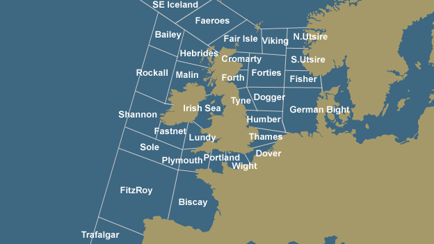
The regions of the UK Shipping Forecast, for which the BBC produces regular weather forecasts.

Should I buy (or pack) an umbrella or sunblock?  Which way do I point my windmill?  How do I trim my sails?  Do I go fishing tonight or wait until dawn?  When do I gather my crops?  How you use the data and then generate the insight depends on the audience.  This is life or death for some people.


Online, there's a clearer connection between actions and consequences - if you increase your online advertising spend, you should see more traffic coming to your site (and if you don't, start analysing and find out why, and what you should do about it).  With the weather - you can't make it rain, but you can work out why it rained (or didn't), when it's going to rain again (because you know it will), and what steps to take in order to make the best of the weather.  If you work in a team or a situation where the brand, marketing and advertising decisions for the online channel are made by an offline team with TV, radio and press expertise, you may find yourself in this kind of situation:  do not despair!

Wisdom

Some insights can be demonstrated repeatedly, and described succinctly so that they eventually become gathered wisdom:

"The north wind doth blow, and we shall have snow."
"Red sky at night, shepherd's delight; red sky at morning, shepherd's warning"

In online marketing, it could be something like, "Always show the discounted price in red", (honestly, I wrote that before I discovered that somebody genuinely thought it was a good idea) or "Never show a banner with two different products" (I'm making this stuff up).

No amount of data will automatically produce wisdom.  Big data (however big that might mean) will not spontaneously transform into insight and wisdom when it reaches a critical mass, in the same way that no amount of charcoal will produce diamonds even though they're made of the same stuff.

Actionable

Data, analysis and insight are useful tools and worthwhile aims - providing that they are actionable.  In my examples, I've been talking about using weather data to inform decisions, such as whether to wear a sunhat or a raincoat.  In this case, the data on temperature and rainfall are critical.  In online analysis (or in any kind of data analysis) it's vital that the analysis and insight are focused on the key performance indicators - that's what will make it actionable.  Talking about traffic to the landing page or the product information page will be trivial unless you can connect that data point to a key data point which drives the business - such as conversion, margin or revenueWhen you gather the data which enables you to tie your analysis and insight to a KPI, then your insight is far more likely to be actionable (I say this as your recommendation may be profitable but not feasible).

"My analysis shows that if we direct traffic from the landing page to page B instead of page A, then we will see an increase in conversion because 65% of people who see page B add an item to cart, compared to 43% for page A."  You can almost hear the sound of the checkout ringing.


"If we change our call to action from 'Buy Now' to 'Find out more', then the click through rate will go up."  Yes... and then what?  The click-through rate is probably a good data point to start with, but how much will it go up by, and what will the impact be on the website's KPIs?

Conclusion 

  If data analysis (sales revenue, time, banner description and click-through rate) indicates that sales revenue drops when you mix your products in your banners, because people ignore the higher priced product and only buy the cheaper one, then this can move from data to analysis to insight to wisdom.  It may take repeated observations to get there (was it a one-off, does it apply to all products, does it only happen in summer?), but it shows how you can move from data to analysis to actionable insights.

Other articles I've written on Website Analytics that you may find relevant:

Web Analytics - Gathering Requirements from Stakeholders