Header tag

Monday, 15 August 2016

Data, Analysis, Insight and Wisdom

Good web analysts love producing 'actionable insights' - it's the way we add value to the business we're in; it makes our managers happy - it's like finding hidden treasure.  But what are actionable insights (five years ago I asked who makes them actionable - the analyst or the manager) and how can get better at finding them and sharing them?

Web analytics starts with data - this could be various  kinds of data depending on the business model you're following.  So, in order to keep things industry-neutral, I'm going to focus on an unrelated area, and see what we can learn from it.  Yes, I'm going back to my old favourite:  reporting and analysing the weather.


In meteorology, scientists gather all kinds of data from the atmosphere.  They are interested in collecting multiple types of data - or "data points" - from multiple sources in various ways.  And the good news is that this data is quantitative (it can be given a number).

A thermometer will tell you the air and ground temperature - how comfortable things are at the moment
A barometer - the air pressure where you are at the moment
A hygrometer will measure humidity (or possibly rainfall) - depending on conditions
An anemometer - is used to measure wind speed and direction , and will tell you which way things are going to change and where to look for what's coming next.

Each instrument will tell you different things about how things are at the moment.  The anemometer can tell you which way things are going to change, and to some extent, which way to look to see what's going to happen next.  The data that these devices will give you will almost always be numerical (or partly numerical), and certainly abstract.  Each one individually will give you a partial picture of the current situation.  None of them by themselves will actually tell you anything meaningful:  is it raining?  Yes, but has it started, has it stopped, is it getting heavier or lighter?  The temperature may be 16o C but what time of day is it; what time of year is it and is the temperature going up or down?

What is needed here is some analysis.

Analysis is the art of combining the data sources to tell you something more meaningful, with a wider view, and painting a better picture.

One of the easiest forms of analysis is comparison.  It's hot today, but is it hotter than yesterday, this time last week, or this time last year?  Meteorologists typically compare year on year - there's little benefit in comparing sunny May with rainy April (in the UK, in theory).  But comparing May 2016 with May 2015 will tell you if we're having a good spring season.

And comparison leads naturally to trending.  It might be raining more today than it was yesterday, but how does that pattern compare over a longer time period?  And if you want to present this data to a wider audience, you'll either compile a table of data, or produce a graph of your data.  And the analysis is already starting - comparing two forms of data (typically time and another measurement) and producing comparable data (and possibly even trends).

Another form of analysis is statistical analysis - comparing averages, ranges, populations and so on.  Providing you and your audience are agreed on which average you're taking, what it means and what its potential drawbacks are, this can be a very useful form of analysis.


A note:  analysis is not just plotting graphs.  No, really, it isn't.  A spreadsheet can plot graphs, but analysis requires brainpower.  Therefore, plotting graphs (by itself) isn't analysis.  It can help to direct your analysis, and tell you what the data is saying, but a graph is just a set of lines on a page.  Plotting good, meaningful graphs is an exercise by itself, and data visualization is a whole subject of its own.  And a sidenote to this note: there are times when a simple, basic bar chart will be more informative and drive more action than any trendy visualisation with arrows, flowcharts and nodes.  Good doesn't mean visually impressive.

Good analysis breaks down the data into meaningful and relevant sections that will start to tell you more than just the individual data points.  Analysis will combine data points:  for example, imagine combining temperature data combined with geographic data, compared to average data:


This data has been presented in a very accessible way, and you can see at a glance that the southern half of the UK had a slightly-wetter-than-average January, whereas the northern half of the UK, and especially Scotland, was much drier than average.  

This is analysis clearly presented.  However, it isn't insight:  I haven't explained why the rainfall varied so much.  And if you're looking to explain why the rainfall in January was less than in June (for example), then you can easily point to annual trends:  the rain in January is always less than in June.

Insight

Insight is the next step from analysis, and insight will often show you WHY something is happening.  Yes, I know you won't fully answer "why" visitors behave in the way they do just by consulting quantitative data, but it's a start - and additionally, you'll be able to answer why a number went up, down or sideways.  You'll know you're beginning to show insight when you've stopped drawing graphs and tables, and started writing in sentences.  And not just describing what the data is saying, either, but explaining what's actually happening and the underlying causes.  "Total sales this week fell from 100k to 74k" isn't analysis.  "Total sales fell from 100k to 74k due to the conclusion of the summer sale and a drop in men's shoe sales; last year we continued the sale for an extra month and consistently achieved 100k+ sales for an additional three weeks with no loss of profit."

Or, to keep within the weather theme: "Rainfall in the south and east was above average throughout June due to a series of Atlantic storms which passed over continental Europe; in previous years these storms have tracked much further south."

Insight is about using the data to tell you about something that's happened before, and what happened next.  For example, we don't watch the weather channel to see what the weather was like yesterday or earlier this morning.  We may watch the weather channel to see what the weather's like now in another part of the country (or the world), but more often we want to know what the weather's going to be like tomorrow.  Good analysis will enable you to generate insights, extrapolate data and forecast future performance.


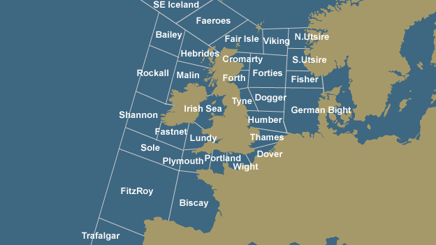
The regions of the UK Shipping Forecast, for which the BBC produces regular weather forecasts.

Should I buy (or pack) an umbrella or sunblock?  Which way do I point my windmill?  How do I trim my sails?  Do I go fishing tonight or wait until dawn?  When do I gather my crops?  How you use the data and then generate the insight depends on the audience.  This is life or death for some people.


Online, there's a clearer connection between actions and consequences - if you increase your online advertising spend, you should see more traffic coming to your site (and if you don't, start analysing and find out why, and what you should do about it).  With the weather - you can't make it rain, but you can work out why it rained (or didn't), when it's going to rain again (because you know it will), and what steps to take in order to make the best of the weather.  If you work in a team or a situation where the brand, marketing and advertising decisions for the online channel are made by an offline team with TV, radio and press expertise, you may find yourself in this kind of situation:  do not despair!

Wisdom

Some insights can be demonstrated repeatedly, and described succinctly so that they eventually become gathered wisdom:

"The north wind doth blow, and we shall have snow."
"Red sky at night, shepherd's delight; red sky at morning, shepherd's warning"

In online marketing, it could be something like, "Always show the discounted price in red", (honestly, I wrote that before I discovered that somebody genuinely thought it was a good idea) or "Never show a banner with two different products" (I'm making this stuff up).

No amount of data will automatically produce wisdom.  Big data (however big that might mean) will not spontaneously transform into insight and wisdom when it reaches a critical mass, in the same way that no amount of charcoal will produce diamonds even though they're made of the same stuff.

Actionable

Data, analysis and insight are useful tools and worthwhile aims - providing that they are actionable.  In my examples, I've been talking about using weather data to inform decisions, such as whether to wear a sunhat or a raincoat.  In this case, the data on temperature and rainfall are critical.  In online analysis (or in any kind of data analysis) it's vital that the analysis and insight are focused on the key performance indicators - that's what will make it actionable.  Talking about traffic to the landing page or the product information page will be trivial unless you can connect that data point to a key data point which drives the business - such as conversion, margin or revenueWhen you gather the data which enables you to tie your analysis and insight to a KPI, then your insight is far more likely to be actionable (I say this as your recommendation may be profitable but not feasible).

"My analysis shows that if we direct traffic from the landing page to page B instead of page A, then we will see an increase in conversion because 65% of people who see page B add an item to cart, compared to 43% for page A."  You can almost hear the sound of the checkout ringing.


"If we change our call to action from 'Buy Now' to 'Find out more', then the click through rate will go up."  Yes... and then what?  The click-through rate is probably a good data point to start with, but how much will it go up by, and what will the impact be on the website's KPIs?

Conclusion 

  If data analysis (sales revenue, time, banner description and click-through rate) indicates that sales revenue drops when you mix your products in your banners, because people ignore the higher priced product and only buy the cheaper one, then this can move from data to analysis to insight to wisdom.  It may take repeated observations to get there (was it a one-off, does it apply to all products, does it only happen in summer?), but it shows how you can move from data to analysis to actionable insights.

Other articles I've written on Website Analytics that you may find relevant:

Web Analytics - Gathering Requirements from Stakeholders

Wednesday, 13 July 2016

My Favourite Chess Game

I've covered a range of my Chess games in the past - some wins, some losses - but in this post I'd like to review my favourite Chess game, the strongest opponent where I scored a win.  This was within the Kidsgrove Chess Club's own internal league, and all six players played each other twice (once as White, once as Black).

This was my game against Jules H, the strongest player I've scored a win against.  I was White, and played my standard Queen's Gambit.

1. d4 d5
2. c4 e6
3. cxd5 exd5


Now I'm sure 3. cxd5 is regarded as a poor move, reducing the tension in the centre, but I thought it made sense to trade my c-pawn for my opponent's central e-pawn.

4. Nc3 Bb4
5. Bd2 Bxc3
6. Bxc3 Nf6
7. e3 0-0
8. Bd3 Re8
9. Ne2 Qd6
10. Ng3 Bg4

I can't play 11. f3 as I would immediately lose to Rxe3+ and have ongoing trouble on the now-open e-file.  However, I identified that Bg4 left b7 unprotected, so I decided to play Qb3 and look to castle as soon as possible.


11. Qb3 Qb6
12. Qxb6 axb6

No, I wasn't initially intending to trade queens, but since I could leave a scar on my opponent's pawn structure, with b7 as a fixed weakness, I decided to go for it... and then finally castled!

13. 0-0 g6
14. Bd2
Supporting the e-pawn, so that I can finally push play f3, which will kick the bishop and in future enable me to play e4.


14. ... c5  My opponent looks to straighten out his kingside.
15. a3 c4
16. Bc2 Bd7
17. f3 Nc6
18. Rae1
Completing my development. Putting the rooks behind the e- and f-pawns should enable me, with the support of the minor pieces, me to push them forwards and make significant gains in space.


18.  ... b5
My opponent is grabbing space on the queenside, but I'm slowly and steadily preparing to advance my central pawns.

19.Bc3 Re6
20.e4 h5
21.Ne2? dxe4?
22.fxe4

After getting lucky with Ne2, I've now developed a t
riple threat:  

I can advance the d-pawn, forking knight and rook, and if the rook retreats I can then capture the knight on f6.  If the rook moves to d6, I can then also advance the e-pawn, forking the rook and the other knight (the pawn on e5 would be supported by the bishop on c3.  The bishop pair on c2 and c3 are beginning to see their diagonals open up, and they're pointing towards black's king.


22. ... Re7?
A blunder, since I can immediately play Rxf6.  I guess the complications of the position got to my opponent, and he figured he could save his pieces by retreating the rook.  The software I've consulted suggests ...Nxe4 as a better continuation for Black.

23.Rxf6 Nd8
24.Nf4 Ra6
25.d5 b6?

I'm not sure what my opponent was doing with these moves.  After threatening my rook on f6, he's now locked his rook out of the game, and is continuing to play on the wings, while I move through the centre.

26.e5 Nb7

Earlier that week, I'd been reading about 'clearing the barriers' towards your opponent's king, and I considered this very carefully.  I'm a knight ahead (after the capture on move 23),  so I have extra material to play with.  Also, I have both of my bishops pointing towards white's king, so I anticipated that after Nxg6 I would force white's king into the corner, and potentially get a discovered check to capture more material.  After 28. Rxg6+ Kh8 I can play e6 winning a bishop, or after 
28. Rxg6+ Kh7 I can play Rxb7+ winning a rook.

So I went for it, trading my knight for two pawns and a direct attack.
27.Nxg6 fxg6
28.Rxg6+ 


After 28 Rxg6+ there are possibilities for me to win material through discovered checks

28.  ... Kf8

Avoiding both of the discovered checks, but enabling me to bring my other rook into play with a tempo.

29.Rf1+

I was expecting 29...Rf7 30.Rxf7+ Ke8 31.e6 Bxe6 32.dxe6 which lengthens the game but enables me to win more material.  Instead...

29. ...  
Ke8
30.Rg8# 1-0


A surprisingly quick finish to a very pleasing game.  I appreciate that my opponent made a few suspect moves, but I'm pleased with the way I handled the game, the tactics and strategies I used (placing my rooks and bishops on squares that would maximise their range and usefulness) and as I said, this is probably one of my favourite games.

Here are a few of my other Chess games:

My earliest online Chess game
My very earliest Chess game (it was even earlier than I thought)
 
The strangest game of Chess I ever played - 1. d4 d5 2. c4 b5
I was not sure what I was supposed to do with that; apparently I was supposed to play 3. c4xb5, but played 3. c4xd5 and immediately and unintentionally took my opponent out of his prep.

The Chess game I'm least proud of
I got greedy, tried to hold onto a pawn that I should have given back, and expended a lot of time and effort on it, instead of protecting my King (on the other side of the board)

Thursday, 30 June 2016

Revisiting Fibonacci Constants

In a previous post (four years ago), I explained the Fibonacci Series - where it comes from, how it originates, and how it can appear in nature.  I also talked about the golden ratio, which is the ratio between subsequent terms in the Fibonacci Series.

I've been doing some further reading and research on the Fibonacci Series, and have been doing some of my own calculations and investigations.

Firstly:  what happens if we extend the series, so that instead of just summing the two previous terms, we sum the three previous terms, or the four or five previous?

This has been done before (I wasn't too surprised), and these are known as the following:
Fibonacci - 2 terms
Tribonacci - 3 terms
Tetranacci (or quadranacci) - 4 terms
Quintanacci (or pentanacci) - 5 terms
Hexanacci - 6 terms


I struggled to find names for the higher-number terms, so I'm going to submit my own.

Heptanacci - 7 terms
Octanacci - 8 terms
Nonancci - 9 terms
Decanacci - 10 terms

I stopped at 10, as I found that the data I'd accumulated was enough to draw some interesting conclusions from.  Here are the first few terms of each of the series:

Fib:  0,1,1,2,3,5,8,13,21,34,55,89,144,233,377
Trib:  0,0,1,1,2,4,7,13,24,44,81,149,274,504,927
Tetra: 0,0,0,1,1,2,4,8,15,29,56,108,208,401,773
Quint: 0,0,0,0,1,1,2,4,8,16,31,61,120,236,464
Hex: ...0,0,1,1,2,4,8,16,32,63,125,248
Hept:  ...0,0,1,1,2,4,8,16,32,64,127
Oct: ...0,1,1,2,4,8,16,32,64,128,255,509,1016,2028,4048,8080,16128
Non:  ...0,1,1,2,4,8,16,32,64,128,256,511,1021,2040,4076,8144
Dec: ..,0,1,1,2,4,8,16,32,64,128,256,512,1023,2045,4088

Taking this raw data, I then started to look at the ratios between subsequent terms.  We've seen previously that the Fibonacci series has the golden ratio 1.61803... or (1+ sqrt(5))/2 but what about the other series?

Fib 1.61803
Trib 1.83929
Tetra 1.92756
Quint 1.965948
Hex 1.983583
Hept 1.991964
Oct 1.996031
Non 1.998029
Dec 1.999019

I haven't identified the expressions for each of these but have found from research that the tetranacci constant satisfies x + x-4 = 2.  

Plotting the number of terms being summed (or the n-number for the series) against the ratio gives this graph.
The question is:  will the ratio ever reach 2?  It looks like the line will head towards 2 as an asymptote, but will it reach 2 if N increases?

The answer is no, and my proof is as follows:


Take the N=10 series as an example:
0,1,1,2,4,8,16,32,64,128,256,512,1023,2045,4088

We can see after the initial 0 and 1, that the first few terms are exactly double the previous one.  This is because each term is the sum of all the previous non-zero terms, including both of the 1s.  1+1 = 2, 1+1+2 = 4, 1+1+2+4=8 etc.  In this case, the ratio of each term to its previous term is 2, each term is exactly double the previous one.

However, this doubling of terms eventually ends:  when the sum no longer includes all the previous terms, that is to say, when the sum no longer includes both of the 1s and all subsequent terms, then the ratio falls below 2.  In the N=10 example above, the ratio falls below 2 when we reach 1023.


1+1+2+4+8+16+32+64+128+256 = 512
1+2+4+8+16+32+64+128+256+512 = 1023

At this point, the ratio falls below 2 (1023/512 = 1.998.  This fall will occur for any and all series which follow the "sum of previous terms" pattern; as N increases, it just takes more terms, and the final ratio will get closer to 2, but will remain below it.  As an aside, Wikipedia states that the ratio for an n-nacci series tends to the solution, x, of the equation  (no proof given, although my data confirms it).

Next:  I will look at what happens when we sum the previous term and
half of the term before that...e.g.  N = 1.5, N= 2.5, N=3.5 etc.


Monday, 30 May 2016

How many photographs (permutations including zero)

My wife and I have recently had our third child - hence I've not been blogging much lately.  However, I've been thinking about blog ideas, or more specifically, I've been thinking of mathematical investigations that I could explore and then, if they were interesting, share on my blog.

Our house is full of family photographs - almost every room has family photographs in it - and in particular on one wall, we have three photographs:  one of our daughter; one of our older son, and one of the two of them together.

In mathematical notation, let's call my daughter A and my older son B; so we have A, B and AB.

Now we have three children, and I have started considering how many photos we would need to show the same range of variations... and it's more than I thought.  Let's introduce the baby as C.

We would have:
A, B, C - each child individually
AB, AC, BC - each child with one other sibling
ABC - all three children together.

So the total number of pictures has gone from 3 to 7.

Let's suppose we have four children, A, B, C and D, and we want the same range of photos, with all variations.  The list grows dramatically:

A, B, C and D - individual photos - 4
AB, AC, AD, BC, BD, CD - pairs - 6
ABC, ABD, ACD, BCD - trios - 4
ABCD - group - 1
Total = 15

Children  Photos
1   1
2   3
3   7
4   15

In order to work out the nature of the series, I looked at the differences between terms, and then the second differences (i.e. the differences between the differences).
3-1 = 2
7-3 = 4
15-7 = 8

4-2=2
8-4 = 4

What became clear to me at this point is that the sequence is expanding exponentially or logarithmically, and not quadratically.  And then it very quickly followed that each nth term is 2n -1 (the series 2n is immediately recognisable - 1, 2, 4, 8, 16, 32 etc).  The need to introduce the -1 suggests to me that we're excluding the photo which has no children in it.


I had not expected a logarithmic series from this starting point; in fact I had not expected expected the number of photographs to increase so quickly - the volume more than doubles each time, as we have to account for every combination incorporating the new child. I was expecting something similar to a Fibonacci series - but that's more about multiplying rabbits, not children!


Monday, 29 February 2016

BODMAS puzzles - what's the fuss?

There's a phase going round Facebook where unsolvable, convoluted maths problems are doing the rounds: The question starts: "93% give the wrong answer, only a genius can solve this."  And there's usually a picture of Albert Einstein. And then there's a maths question  - they vary in length but have the same general shape: single-digit numbers separated by various maths functions.

3×4+1-3+4 = ?

You don't have to be a genius, you just need to understand the rules of maths grammar.

And, since this has been shared on Facebook, you'll also gave to explain clearly why your answer is correct in the face increasing ire.

All the best with that.

Saturday, 30 January 2016

Back to the Future: DeLorean Acceleration Rates

Towards the end of the film Back to the Future, Marty McFly has to accelerate the DeLorean time machine up to 88 mph in order to travel from 1955 to 1985.  

Doc Brown explains: "I've painted a white line waaayyy over there on the street. That's where you start out. I've calculated the distance and wind resistance to active the moment the lightning strikes. This alarm will go off and you hit the gas..."


Simple question:  how far away was the start line from the electric overhead wire and the clock tower?

We can use simple dynamics (or kinematics) to calculate the distance the the DeLorean would have needed to reach 88 mph, if we know the car's rate of acceleration, and take it as a given that the car is starting from rest (it's stationary).


The formula to use is v2 = u2 + 2as where v is the final velocity (88 mph), u is the start velocity (0 mph), a is the rate of acceleration, and s is the distance (which is what we want to know).

Inserting u=0 and rearranging, we have s = v2 / 2a.

According to the Wikipedia entry for the DeLorean, acceleration from 0-60 mph took 8.8 seconds.  And this is where it gets tricky, because s = v2/2a requires consistent units for time in the velocity and acceleration.  I am going to make the simplifying assumption that the acceleration from 0-60 continues from 60-88 mph. In reality, it doesn't, but we'll assume it does.

60 mph = 60 / (60 × 60) miles per second = 0.01666 miles per second.

To reach this speed in 8.8 seconds, the acceleration rate is 0.01666 / 8.8 = 1.8939 ×10⁻⁴ miles per second per second. 

88 mph = 88/ (60×60) miles per second = 0.02444 miles per second. 

Time to plug in the numbers:

s= (0.02444) 2 / (2× 1.8939 ×10-4)

s = 1.572 miles

And, just for interest, how long (seconds) would it take? That's easier, using v=u+at and solving for t: t = v/a = 88/8.8 = 10 seconds.

So, the Start Line was just over a mile and a half from the clock tower, (perhaps you could describe that as "waaay over there" with some dramatic licence)  and the journey would have taken 10 seconds (all assumptions taken into consideration).  Somehow, though, it seems a little bit longer on screen.

Some other 'everyday maths' articles I've written:

A spreadsheet solution - the nearest point to the Red Arrows' flightpath from my house
The Twelve Days of Christmas - summing triangle and square numbers
Why are manhole lids usually circular?


Thursday, 17 December 2015

Should Chelsea Sack Jose Mourinho?

In previous posts, during previous football seasons, I've monitored the performance of certain football managers - in particular David Moyes and Louis Van Gaal.  I'm not really targeting Manchester United specifically, it's just that over recent seasons, they've had a tough time and there's been some speculation about their managers' futures.  In fact, Moyes was sacked before his first season was finished.

This season, Chelsea's Jose Mourinho is coming under scrutiny.  At the time of writing (16 December 2015) his team have played 16 games and are in 16th place (out of 20) and sliding towards the relegation zone.  But is the situation really that bad?  It's time to compare his performance against some of the others I've mentioned.  The first comparison is cumulative points achieved through the season, and I'm comparing Mourinho with Moyes (his line is the 'this performance will get you fired' line).

Looking at this, it would appear that Mourinho is not going to last until the end of the season.  There's clearly more going on here - for example, Moyes was in his first season after Ferguson's era of success, while Mourinho is continuing after winning the league title last season.  And perhaps Chelsea (the club, staff and fans) are more loyal to their manager.

So, assuming that Mourinho is going to stay in place, at least for the short term, then let's look at what's going wrong for him (I guess he'll be more aware of this than me, but let's look impartially at the stats).

First of all: the performance during the first ten games of the season:


There's nothing obviously wrong with the number of goals his team is scoring: the problem is with the number being conceded.  Chelsea used to be famous for 'parking the bus' (i.e. scoring a goal and then defending with complete success) but it now appears that they've got a very leaky defence - and too leaky to be a serious challenger for the top position.
  If we compare their current position (after 16 games) with some of the other teams in the league, we find some interesting points:

1. Only two teams - the bottom two, Aston Villa and Sunderland - have lost more games than Chelsea (Chelsea = 9, Sunderland = 10, Aston Villa = 12).  Previous analysis of Moyes and LVG in particular indicated that they were drawing too many matches that they needed to conver to wins.  Mourinho's task is different - it's not stop drawing, it's
to recover more draws from losing situations and to stop losing
Comparison of Jose Mourinho to Alex Ferguson's
first season; final season; David Moyes
and Louis Van Gaal.

As at 16 December, the win/lose/draw rate for the Premier League, sorted by league position
from left to right.  Note the high lose-rate for Chelsea.


2. After 16 games, Chelsea have four clean sheets, ranking them joint 11th, mid-table.  Their issue is not the number of clean sheets they're keeping, it's conceding more goals than they're scoring (I know that seems obvious, but they don't have to keep clean sheets to help them improve their position).


3.  Chelsea's goal difference is not a significant factor. Or, to put it another way: on average, they're not losing by huge margins in their games.  The recommendation based on this (and their significant lose-rate) is to play more aggressively and play less cautiously when they concede a goal.  They can afford to lose by 3 or 4 goals without significantly denting their goal difference compared to the teams around them.


So, should Chelsea sack Mourinho?  Maybe, although perhaps he can be relied upon to change his team's style and go for a more attacking style - he has goals to play with, if not games.

More articles on data analysis in football:

Reviewing Manchester United's Performance
Should Chelsea Sack Jose Mourinho? (it was relevant at the time I wrote it)
How exciting is the English Premier League?  (quantifying a qualitative metric)
The Rollarama World Football Dice Game (a study in probability)